torsdag 25. oktober 2012

Color VS. Black and white

Second post of today guys!

This time I'm going to show you some editing using Adobe Photoshop CS5. More specific, how to make parts of a picture colorful, while keeping the rest of the photo black and white.
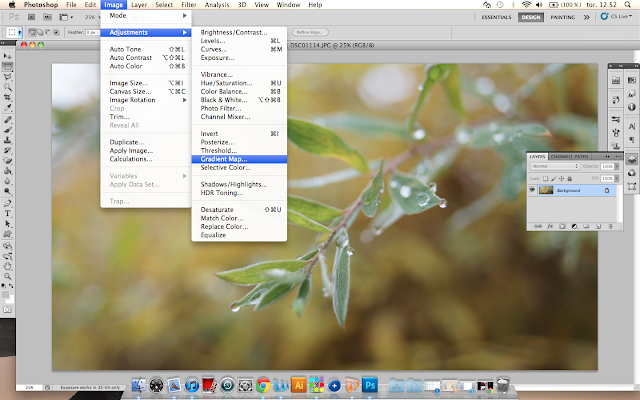
To do this the first thing you need is a start out picture. I chose this one:


After opening the picture in photoshop remember to make a layer copy of your picture by right clicking it in the selection area and choosing "Make background copy". Then take a look at the selection bar at the top of your screen and  click on the "Image" menue, then you select "Image adjustment", and here you will find a selection called "Gradient Map". Now click on that.


Choose black and white and click ok. You should now have a black and white picture.


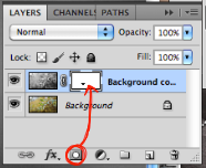
When you have done this, locate the selection area and click on the black and white picture. Then click on the layer mask button (which you can see on the picture to your right.


After doing all this, choose the brush tool. You are going to use this tool to "Color in" a pice of the black and white picture, you can find it in the selection bar to your left. Now if you look at the selection bar at the top of the screen, here you can choose the sise and style of your brush tool. I wold go for a rather small brush with feathered edges.

At the same time, make sure that you have a black and white color square (see bottom red circle of selection bar to the left) Switching between having a black square at the top and a white square at the top; will make it possible to either "color in" an area or make it black and white. (you can change between the two using the letter X)

While doing this your screen should be looking something like this.


Notice, this picture is zoomed in. This helps when "coloring in" the different areas. 
Then comes the final result. You should now have a picture which is part black and white, and part colored.
I hope you enjoyed this tutorial, and that it helped you a bit while working with photoshop and editing. 


Here is a picture of my final result. 


Weird signs on a fancy camera

Hey again guys!
Since my teachers are gonna go through my blog this week; and I'll be getting a grade on everything I have done, I figured out it was about time to do the tasks I missed out on while being sick.

So, first things first. Have you ever noticed a setting called ISO; while taking pictures with your SLR camera? I guess most of you have, and you know how too use it. Either way, I am going to explain a bit about it. The ISO setting is a light sensitivity setting. Low setting = low light sensitivity. High setting = Hight light sensitivity.

To show you the difference, here are to very simple pictures I took right outside the school. One with a low ISO setting of 200, and one with a high setting of 1600.


Most cameras also have automatic ISO settings, that adjust the light sensitivity according to the amount of light you are surrounded by. If you are adjusting the ISO yourself, you should remember that if you set it to low, your picture might end up way to dark. While on the other side; setting it to high, might make your pictures grainy and overly bright. 

onsdag 24. oktober 2012

The five categories, part 2.

Before I start this blog post, I'll have to warn you guys; it's going to be a long one. But bear with me, it's going to be a good one.

You might remember that earlier I had a blog post withI had pictures tied up to the five categories.
You remember the categories? Right?
- Friends
- Water
- Light
- Composition
- Choose your own theme

Back then I decided to work with my own personal theme, and I choose plants. I didn't really know where to start or what to do. But the pictures turned out not so bad, and since that time I have learned a bit more about the whole consept of taking pictures. This actually suited me quite well, as the next school task we got assigned was to work with the five categories once again. This time we were going to take a minimum of 10 photos; 2 for every theme (or maybe 3 for one, and only one for another) but, in the end we would be left with 10 pictures, and a favorite picture (which could also be one of the 10 photos) As another detail, I would like to say that I've used the same camera for all my pictures; a Sony SLR Camera from 2012.


Here are the pictures from my first category: Water.


I was heading home from school when I took these pictures. In fact, I was jumping over my neighbors fence; behind my garage, when I spotted a cobweb covered in tiny drops of water. It was hanging right above the ground, and I had to lie down to get a good shot of it. I used the Macro effect on my camera, to get the focus on the raindrops just right. I also did the same thing with the second picture; which is taken right on the ledge of my terrace. I feel that the composition of both pictures is placed in the golden ratio.
Both pictures also had ISO settings on automatic, a setting which adjusts the ISO according to the light.

The next category ended up being: The self chosen theme, which in this case was nature.


With this category, I couldn't decide for just two pictures... So I didn't, and I ended up with the tree. All pictures were taken on my trip too Vårlivarden (and you might recognise some of them from an earlier blog post) I really like the contrasts in the 1. and 3. picture, the way the colors work together and how the different elements effect each other. When taking the to pictures I used a landscape effect on my camera, which allows me to get the lighting right, as well as the details. The middle photo I once again used my trusted cameras Macro settings.
The third and last picture in the category is also my favorite one. I feel that it might be one of my best photos too, even though the composition of the picture might be a bit off if you are looking through the golden ratio (then the tree could have been a bit more too the right) The color of the photo has to be the main focus, the big contrast from the dark Norwegian sky, the light brown grass, and the small green tree. I feel that the idea of the whole picture was to almost make it look like you were looking into another world or dimension.

The 3. category here is light.


The first photo I took in my living room with no other light source then the candles themselves. I had the aperture sett on 200/1 and a dark light setting. The second picture I took at the busstop with my boyfriend. I let the sunlight blind the cameralens a bit, and you can see the sun reflection.
First picture had the ISO setting on: 400, and the second one on: 1600.

And then there was the Composition.


In he first picture I wanted the color contrast to be everything, but I also wanted some repetition to make it more dynamic. That's why I decided on the picture of my house, the contrast between the blue and brown is really great and the blue in the curtains really just make the skys stand more out. It's taken from a very low perspective (since I am not THAT tall) The second photo I took at night, around half past 11 in the evening. I used a black and white photo filter and edited it some more in photoshop to make the contrasts even bigger. I like how the lines in the road and the cars going by gives the picture a lot of movement.

Last category was the Friend category.
And since the firs person that came to my mind when thinking of friends was my best girl friend, I couldn't go by without a portrait of her.


This might not be a picture that shows friendship on a high level, but it means a lot to me. It is also a very good picture of a very good looking lady. The ISO setting was 400, but I took the picture in quite a good light setting.
I also focused a lot on contrast in this picture, and I felt that the black and white editing, with a small touch of red made everything jump to another level.

Now that you have seen all my pictures and read my descriptions, I hope you see all the work I have put into it. I was wondering how it would turn out, and I'm hoping for positive feedback.
Thank you all, and goodnight.

Makeup Maniac

Hey again guys!
It's only Wednesday but this week has still managed to get kind of busy. Monday I got a request from one of my best friends, she does makeup as a hobby (it is also what she wants to do in the future.. only in a more horror-ish kind of way) She had gotten a job where she was going to fix the makeup of a ton of actors in an local production of the opera Carmen. I was asked to maybe work as an assistant, and take some photos of her in action; so she could document her work for future use. She is also the same friend that I made a digital portrait of last month; Marina.

So with my new camera hanging in a strap from my shoulder; this Tuesday, I headed down town to get the pictures done. It was a lot of fun meeting the actors, running around backstage, and snapping photos of people in different situations. Everyone was so nice, and my friend did an amazing job with the makeup (I didn't have to help with that and was instead sent to get coffee... felt like a true assistant!) I had to adjust the settings on my camera quite a bit to get the pictures right, the light was horrible and in the beginning everything turned out yellow. The shutter speed was useless, so I ended up focusing on the aperture (I hope that's the right photo term) and set all the cameras light settings to indoor, fluorescent lights, and after a while I managed to get a hang of it.

Here are what I thought were the best pictures. My friend did a great job, and I had a great time, so I believe you will have one too, looking through them.


mandag 22. oktober 2012

Zoom in

I went out into my backyard today. The weather was quite nice, as the sun was shining and it wasn't too windy. So, I decided to take some pictures, and try out some of the effects on my camera. I decided for the macro effect. The macro effect is used too take pictures of flowers, or other things with tiny details; at the same time as it let's you "blur" out area of the picture so the area you are zooming in on gets even more detailed.

What I think gives you the best macro pictures, is the right light. If it's to dark or clouded outside, the same thing is going to happend to your photos. Well, at least here is what I ended up with.


Winter is coming

Fall has defiantly arrived in Norway, and I bet that winter isn't far behind. Last weekend I realised that I had completely forgotten about the gym task that was assigned to me...over a month ago. That was also the moment I noticed it had to be done by Sunday afternoon.
The gym assignment was to go for a trip, to some mountain around the area. Bring food, friends and take pictures to document the trip. Luckily for me it didn't take long to find some other people to join me for the trip. Sunday arrived and we put on warm clothes, shoos and wooly socks; and headed outdoors. The pictures from the trip turned out much better then I had imagined (but I guess that's what happens when you got a new camera, that you know how too use)
Anyways, here are some of the pictures from the trip. I hope you enjoy the Norwegian Outdoors.


torsdag 18. oktober 2012

Editing... or something


Well well, well. Here we are again, with a new photo task. Todays task was all about editing. After going through some stuff in class, and watching a 10 minute video about working with pictures in photoshop, we went outside and started taking some pictures.
It wasn't that simple getting the right shots; since it was raining outside, and not that much interesting inside the school itself. Yet, we managed to end up with some pictures. One of a sink, one of a big statue on the 4'Th. floor and one of a How I Met Your Mother dvd. Here's how they turned out.


mandag 15. oktober 2012

The Steampunk killer

I have also been working some more with my digital drawing board. I wanted to see what I could do with a sketch/drawing I had already made on paper, but since I don't have much of a clue when it comes to digital art I went straight too Youtube looking for inspiration and help in the form of videos.

Here is the video that gave me the most help when it comes to shadowing, highlighting and so on.
https://www.youtube.com/watch?v=oGf_ZObMM-c

The drawing I wanted to work with was this:


This is a scanned version of the original drawing, wich I have live traced using Illustrator and darkened the to show the details a bit better.
I made the drawing this summer while on Holiday in Greece. It was inspired by a "How to draw steam punk" book that I got for my birthday a month earlier.

Anyways, I put the scanned picture into photoshop and continued my work there. The methode I used is what I picked up and learned from the video above. And I would encourage anyone who wants to do the same thing, to watch that; and other, videos.

And at least, here is how the finished picture turned out.


Na na na na na na na Batman!

I woke up this morning feeling tiered, cold and definitely not ready to face the day. The autumn vacation had passed and going back to school didn't sound as great as you would think...
But I got up, jumped in the shower, and headed downstairs for breakfast. And now, I am sitting here at school thinking; that instead of complaining about an early winter and cold mornings, I should be showing you guys what I have been working on for the last couple of days.

You see, my boyfriend just switched rooms with his sister, and as an attempt to make the new room a bit more awesome then the white plain walls that were there from before we decided to paint. I decided to paint. It couldn't be anything, not some crazy wall art made up off a ton of colours either. It had to be simple, but not to simple. So, after a while of working with some pictures I found and simplifying them a little bit, I ended up with a nice starting point; Batman. A character he absolutely loves... probably a bit to much. And from that point I knew exactly what to do.

And here are the pictures of the work in progress, and how it turned out!


torsdag 4. oktober 2012

When you'r out with a cold

Once again I have managed to get sick! And once again I am sitting at home, not being able to take place in my photography class. I e-mailed my teacher asking for todays photo task, but didn't get a reply, so I decided to work on my own stuff instead.
Today I have once again been working digitally with my drawing board. I have to say, even though I have not been working for a long time, I do believe I am getting better. Todays work started with a sketch I made a couple of months ago, and here is how it ended up.  


I hope you enjoy it as much as I have enjoyed working with it.